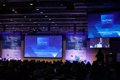
The main theme of the forum is “E-Commerce HD⊃2;: Homo Digitalis in High Definition”. The centre of attention of its participants will be a human being – the client, whose interests are determined by the development of modern e-commerce.

The conference website
ecom21.com has become even more modern, trendy and convenient. The design of the website has been completely changed, its menu structure has been improved, as well as the navigation, which has become even more convenient not only in the desktop version, but also on all mobile devices.
“Less than two months remain until the start of the conference, and it is the peak time for visiting our website. Besides, until 1 October it is possible to register for participation in eCom21 at a discounted price. We have tried to make the website even more convenient, beautiful and saturated with useful information,” said the Executive Director of eCom21 Ilya Shevchenko.
The website provides the conference programme, biographies of keynote speakers and news on e-commerce. As well as, in three clicks, one can register as a participant. When registering before 1 October, the cost of participation in the forum for one person is EUR 700, for three and more persons – EUR 595 each.
The new version of the website has been developed by Scada - a company which is well known for its competence in the design of corporate and financial projects. Specialists from Scada offered a new original brand style for the conference homepage.
“We liked the approach of the new website developers – it was a profound development of the look, symbols with graphics and usability of the website; even the philosophy of the brand has been affected by the numerous changes implemented by the Scada studio during the creativity process,” noted Ilya Shevchenko. The website has become different, unusual, noticeable and, at the same time, somehow familiar and very close.
“Having analysed websites of different conferences, we noted very similar solutions, based on a standard design. The majority of forums do not pay sufficient attention to their look on the internet, in this way depriving themselves of individuality.
Only some giants seriously think about it, like, for instance, conferences of Bloomberg – at times, their design even becomes slightly ‘mad’. Such an original approach appeals to us and, from the very start, we decided to make the website special, looking different from others. The style was based on the Suisse font from the Swiss company Swiss Typefaces, which has outlined the tone and mood of other elements – the layout, lines and general sterility.
For accentuating, we have developed animation circles, which graphically represent the main essence of the conference – professional communication and interaction, expansion of business contacts. We hope that the result will please the participants and guests of eCom21,” said Karl Plaude, Art Director of Scada studio.
Scada has been operating on the market for 15 years and has extensive experience in designing corporate and financial projects. Eleonora Gailisha Mass Media and Public Relations
Phone: +371-67020506
Fax: +371-67020563
E-mail:
egailisha@rietumu.lv
